定义背景图像
background-image:属性值是指定背景图像的相对地址或绝对地址。格式可以是GIF,JPG和PNG
GIF与JPG支持透明图像。
设置渐变背景
linear-gradient:使用线性渐变创建背景图像
radial-gradient:使用镜像渐变创建背景图像
repeating-linear-gradient:使用重复线性渐变创建背景图像
repeating-radial-gradient:使用重复径向渐变创建背景图像
linear-gradient属性值:[position||angle],[start-color],····,[last-color];
position:定义渐变起始点,包含数值,百分比,也可以使用关键字。left、center、right定义x轴坐标;top center bottom指定y轴坐标,指定一个值时,另一个默认为center。需要与to一起使用
angle:定义直线渐变角度。单位有deg(度,一圈360deg),grad(梯度,90度=100grad),rad(弧度,一圈=2*PI rad)
start-color:定义起始渐变颜色,有两个参数,第一个参数是任意颜色值,第二个参数是颜色的未知,取值是百分比或数值,可以省略
last-color:定义最终渐变颜色,与start-color用法一样
radial-gradient属性值:[shape] [size]at [position],start-color,····,last-color;
shape:定义镜像渐变的形状:circle圆形,ellipse椭圆,默认椭圆
size:定义原的半径或者椭圆长度,或者是固定值;
closest-side :指定径向渐变的半径长度为从圆心到离圆心最近的边;
farthest-side :指定径向渐变的半径长度为从圆心到离圆心最远的边;
closest-corner : 指定径向渐变的半径长度为从圆心到离圆心最近的角;
farthest-conner(默认):指定径向渐变的半径长度为从圆心到离心最远的角。
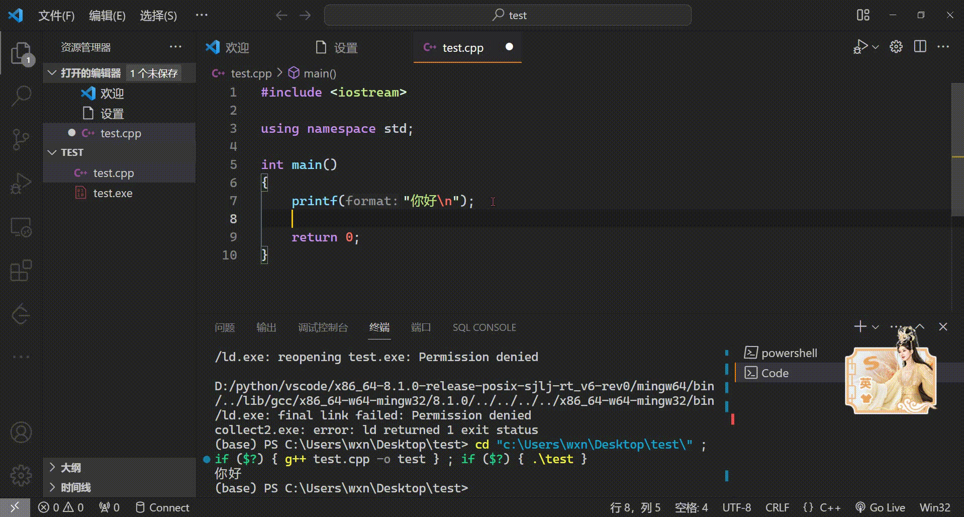
<!DOCTYPE html>
<html>
	<head>
		<meta charset="utf-8">
		<title></title>
		<style>
			.s1{
				width: 300px;
				height: 30px;
				background-image: linear-gradient(to top,red,yellow);
			}
			.s2{
				width: 300px;
				height: 30px;
				background-image: linear-gradient(45deg,red,green,yellow);
			}
			.s3{
				width: 300px;
				height: 300px;
				background-image: radial-gradient(circle 50px at 40% 40%,red,blue,yellow);
			}
		</style>
	</head>
	<body>
		<div class="s1"></div><br />
		<div class="s2"></div><br />
		<div class="s3"></div><br />
	</body>
</html>